CRAFT VICTORIA
annual report
WILDLIFE VICTORIA
identity
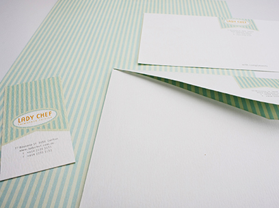
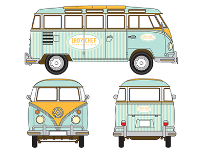
LADY CHEF
identity

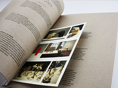

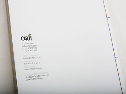
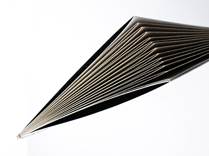


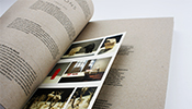
CRAFT VICTORIA
annual report
Craft Victoria is a non-profit company that promotes art and craft culture in Melbourne. The annual report is created with French-fold and Japanese binding; where the cover and contents are using black and white printing on recycle papers to enhance the crafty feel.
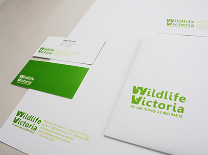
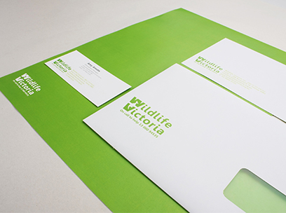


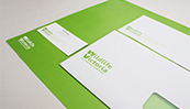
WILDLIFE VICTORIA
identity
Stationary and brochure design for Wildlife Victoria, a non-profit organisation that provides service to sick, injured and orphaned wildlife by responding calls from public.


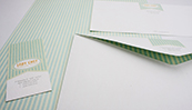
LADY CHEF
identity
A female client is establishing a food van service in Melbourne, selling traditional healthy food from Taiwan. Design solution includes stationary and some other applications, such as the kombi design, menu and website design.
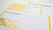
TIGER AIRWAYS
identity
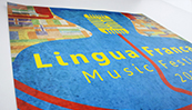
LINGUA FRANCA
advertising campaign
AIR ASIA
product redesign


TIGER AIRWAYS
identity
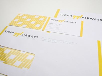
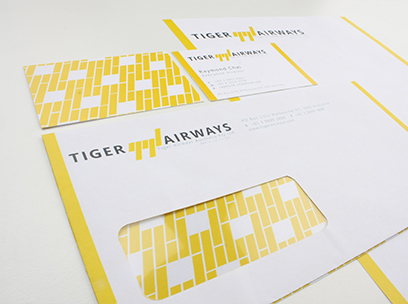
Tiger Airways need to rebrand their current identity in order to create a new public recognition and brand image, due to flight safety issue.
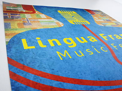
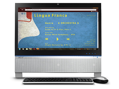


LINGUA FRANCA
advertising campaign
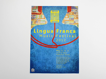
A music campaign aimed to encourage the public to listen to music in different languages. A poster is designed to advertise the music festival, and phone apps together with website design in associate with the festival.
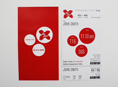

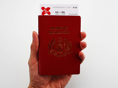


AIR ASIA
product redesign
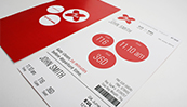
Boarding pass redesign for Air Asia, a budget airline from Malaysia where their current boarding pass looks like a receipt. The aim is to be practical, yet well designed, besides keeping the cost as low as possible.
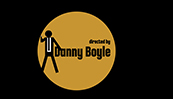
TRAINSPOTTING
movie title
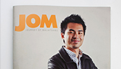
JOM MAGAZINE
publication
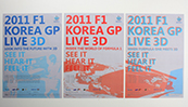
F1 KOREA GP
event poster
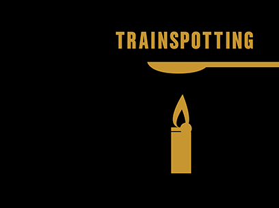
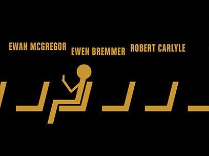
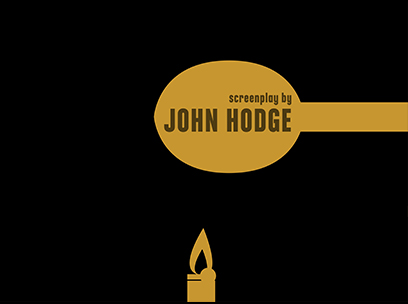


TRAINSPOTTING
movie title
To create a opening title for Trainspotting, a movie about drug addicts.
Watch on YouTube


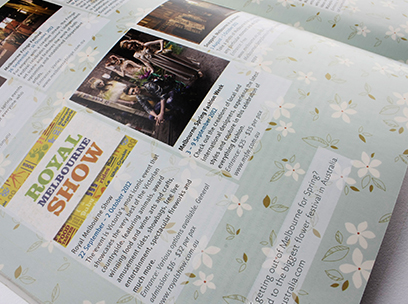
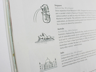


JOM MAGAZINE
publication
JOM is the first Malaysia magazine to be published in Melbourne, writing about what’s going on among Malaysians in both Melbourne and Malaysia. Due to the short notice given, there’s only less than a week to design the whole magazine layout, all by a designer.
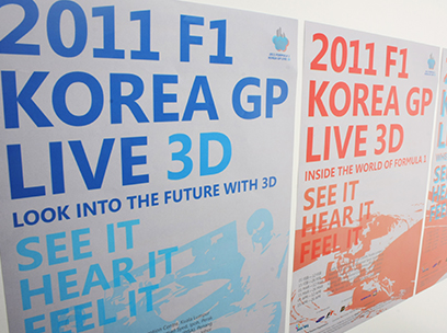
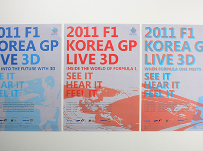


FORMULA 1 KOREA GP
event poster
In order to promote its debut Formula 1 Grand Prix, Korea Tourism Organisation had decided to broadcast the race in live and 3D version. The three variaties of posters represent each different stages of the entire event.
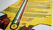
FERRO ROSSO
typo poster

DIGITAL MARKER
illustration
PENCIL SKETCH
illustration
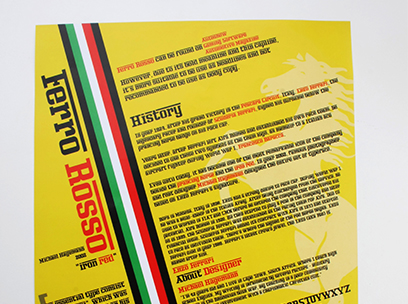


FERRO ROSSO
typo poster
A typeface developed from the logo type of Ferrari, by Michael Hagemann, who has passion in both art and racing machine.

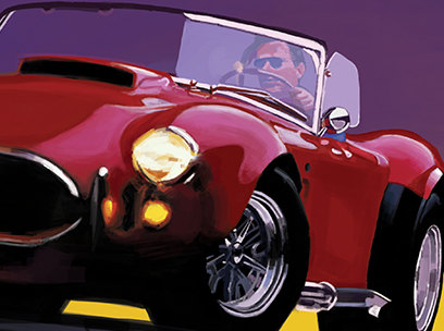


DIGITAL MARKER
illustration
Hand-drawn digital marker with Bamboo tablet on Photoshop.
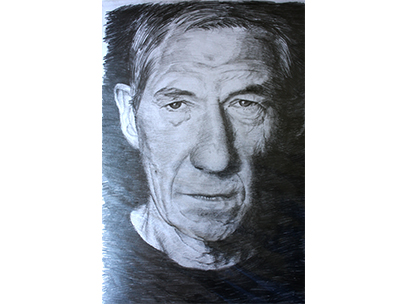
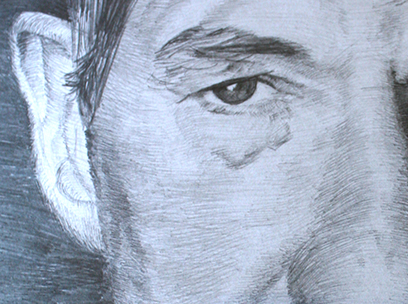
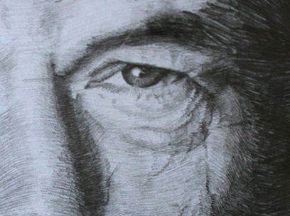


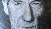
PENCIL SKETCH
illustration
Pencil sketch of Sir Ian McKellen.
<
>